| Author |
Uggie Cruiser concept |
Kenny_Naboo
Marshal
Pitch Black

Joined: January 11, 2010
Posts: 3823
From: LobsterTown
|  Posted: 2010-06-24 05:00 Posted: 2010-06-24 05:00
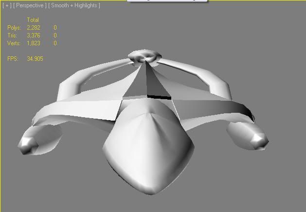
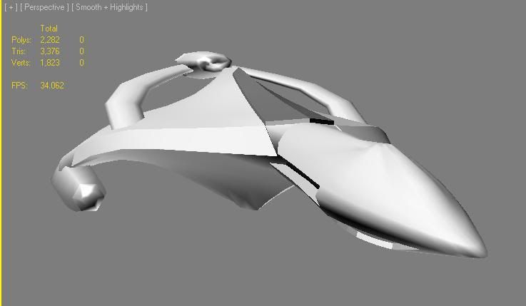
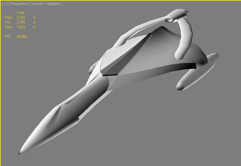
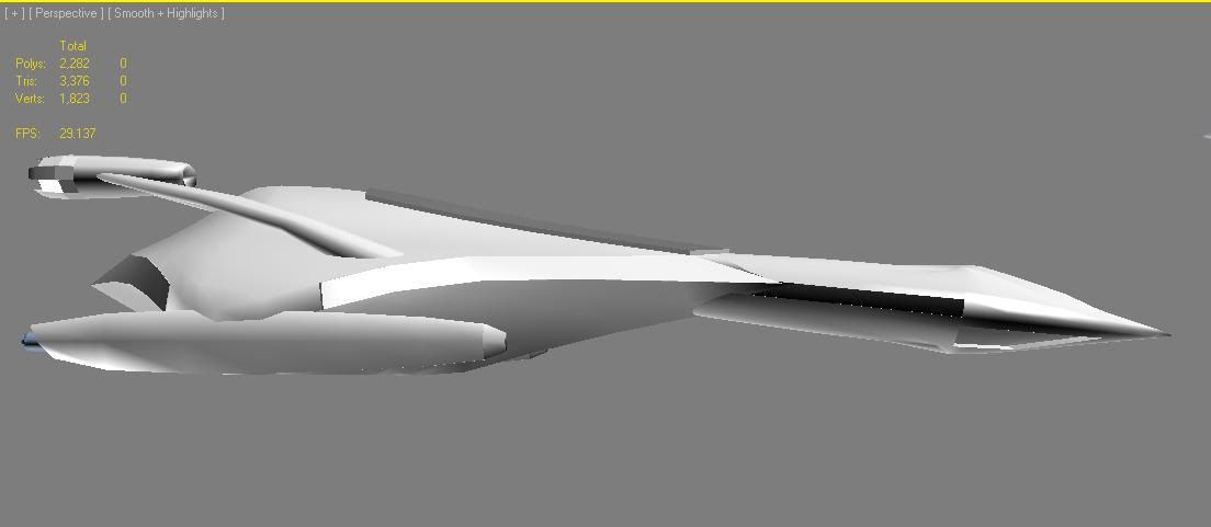
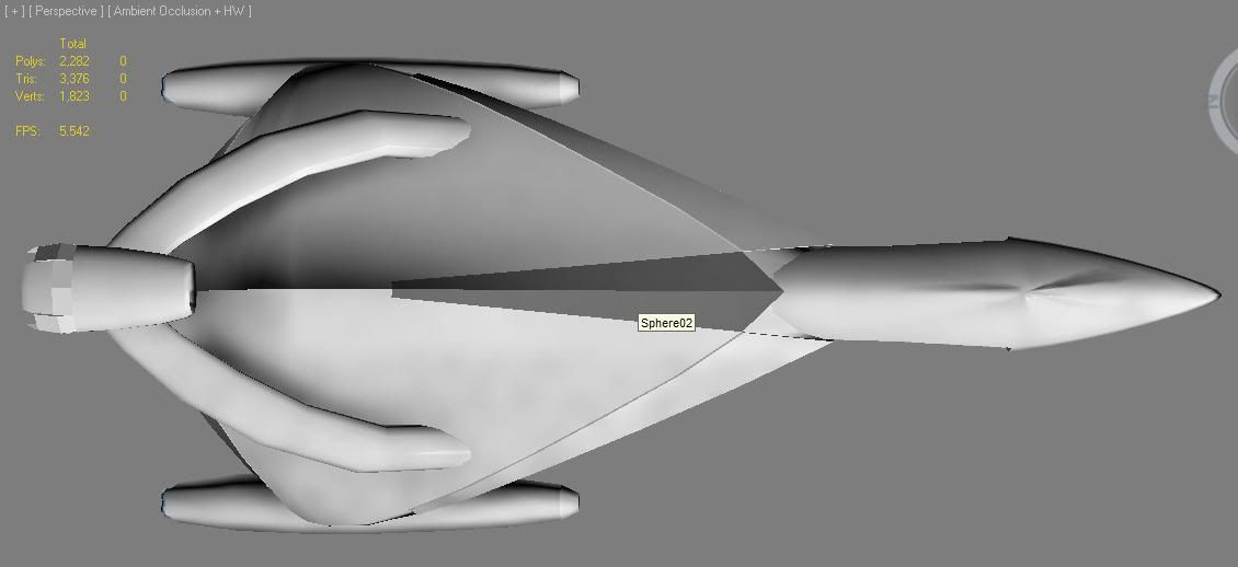
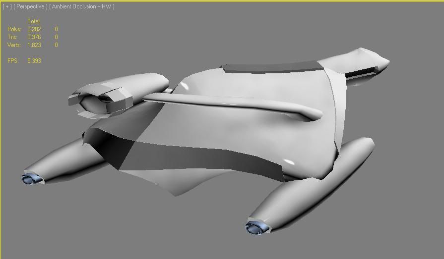
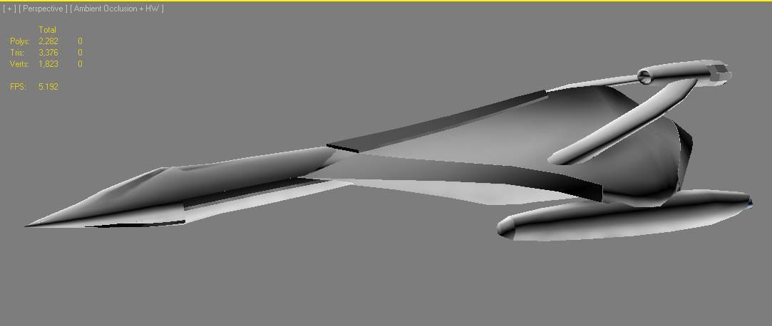
This is a design of a ship that I've had in my head for some time. Began life as a sketch on paper, then translated into 3D.
Something sleek and fast looking. So I added in some distinct UGTO features into it.... such as the tail arc and hi-mount central engine port, as well as the 2 wing pods reminiscent of the current cruiser.
It's slightly organic in the way the "lifting wing" body is designed. But since it's kinda smooth skinned, I figured it might suit an Uggie cruiser.
*Updated* Improved head section
- Less "goosey" head
- slimmer more sleek engine pylon/wing
[ This Message was edited by: Kenny_Naboo on 2010-06-24 06:22 ]
_________________
... in space, no one can hear you scream.....

|
*Obsidian Shadow*
Grand Admiral
Joined: January 03, 2010
Posts: 316
|  Posted: 2010-06-24 05:04 Posted: 2010-06-24 05:04
hmmm i think that that'd make a nice uggie frigate because currently they just look like a rip-off from star trek but that design keeps the UGTO style and looks streamlined and fast like a frigate should be not bloody stretched enterprise
_________________
|
Kenny_Naboo
Marshal
Pitch Black

Joined: January 11, 2010
Posts: 3823
From: LobsterTown
|  Posted: 2010-06-24 11:15 Posted: 2010-06-24 11:15
Rendered view

_________________
... in space, no one can hear you scream.....

|
Veronw
Marshal
Joined: December 13, 2004
Posts: 554
|  Posted: 2010-06-24 13:20 Posted: 2010-06-24 13:20
reminds me of the whitestars in a way, just blockier and fugly 
its too wide across the engine half, and from the side view, it looks amazingly like a pryamid on its side with an egg attached, so id suggest making that skinnier, or at least scaling it back a lot
[ This Message was edited by: Veronw on 2010-06-24 13:21 ]
_________________
|
Kenny_Naboo
Marshal
Pitch Black

Joined: January 11, 2010
Posts: 3823
From: LobsterTown
|  Posted: 2010-06-24 13:57 Posted: 2010-06-24 13:57
LOL. I was intending it to be a Kluth ship, with that wing section. It's basically a flattened and warped sphere. 
Maybe I'll take the hoonam features off and make it Kluth instead.
_________________
... in space, no one can hear you scream.....

|
Kangaroosteak
Grand Admiral
Joined: April 03, 2010
Posts: 149
From: Somewhere...
|  Posted: 2010-06-24 14:12 Posted: 2010-06-24 14:12
Make the back skinnier and it should look ok.
_________________
The Gaifens call to me!

|
Iwancoppa
Fleet Admiral
Joined: November 15, 2008
Posts: 709
|  Posted: 2010-06-24 16:09 Posted: 2010-06-24 16:09
looks like a flying dildo. its uggie
_________________

|
t500
Marshal
Joined: June 20, 2007
Posts: 188
From: vermont
|  Posted: 2010-06-24 16:13 Posted: 2010-06-24 16:13
Quote:
|
On 2010-06-24 16:09, Lulzypulzy wrote:
looks like a flying dildo. its uggie
|
|
HAHAHAHHA!!!!!
_________________
luna nobis providet

|
Sixkiller
Marshal
Courageous Elite Commandos

Joined: May 11, 2005
Posts: 1786
From: Netherlands
|  Posted: 2010-06-24 16:55 Posted: 2010-06-24 16:55
This really looks UGTO. Its basicly the back of a battle dread with the side pods of a battle cruiser.
Edit: Oh yeah, and the front looks like a destroyer. Depending on how big you make it, i think this could be used for almost every UGTO ship class, except scout:p
[ This Message was edited by: Sixkiller on 2010-06-25 03:25 ]
_________________

|
Kenny_Naboo
Marshal
Pitch Black

Joined: January 11, 2010
Posts: 3823
From: LobsterTown
|  Posted: 2010-06-25 08:02 Posted: 2010-06-25 08:02
All feedback n points noted with thanks. Changes coming.
_________________
... in space, no one can hear you scream.....

|
Sixkiller
Marshal
Courageous Elite Commandos

Joined: May 11, 2005
Posts: 1786
From: Netherlands
|  Posted: 2010-06-25 12:11 Posted: 2010-06-25 12:11
Oh, and before a dev comes in and says it, you have to much polys.
Tough, i dont really have a clue how to fix that. Still, i hope someone will help you out on that, because i would defenitly like to see this one in game.
_________________

|
Eledore Massis [R33]
Grand Admiral
Templar Knights

Joined: May 26, 2002
Posts: 2694
From: tsohlacoLocalhost
|  Posted: 2010-06-25 13:38 Posted: 2010-06-25 13:38
he already has the word about the polys. as you can see in his 3dmax shot, he is keeping them under 3K for a dread.
_________________
DS Discordion
|
Tael
2nd Rear Admiral
Palestar

Joined: July 03, 2002
Posts: 3697
From: San Francisco Bay Area
|  Posted: 2010-06-25 14:07 Posted: 2010-06-25 14:07
Looks more destroyer'ish. but I really like it so far...
_________________

|
Jim Starluck
Marshal
Templar Knights

Joined: October 22, 2001
Posts: 2232
From: Cincinnati, OH
|  Posted: 2010-06-25 18:26 Posted: 2010-06-25 18:26
Yes, it certainly captures the underlying premise of the UGTO design style.
_________________
If at first you don't succeed, get a bigger space battleship and try again.

|
Kenny_Naboo
Marshal
Pitch Black

Joined: January 11, 2010
Posts: 3823
From: LobsterTown
|  Posted: 2010-06-26 17:30 Posted: 2010-06-26 17:30
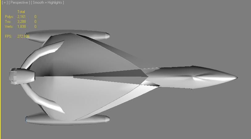
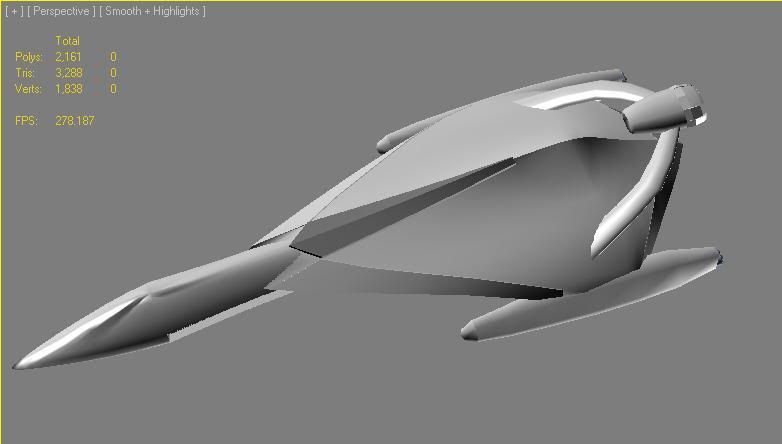
Some updates:
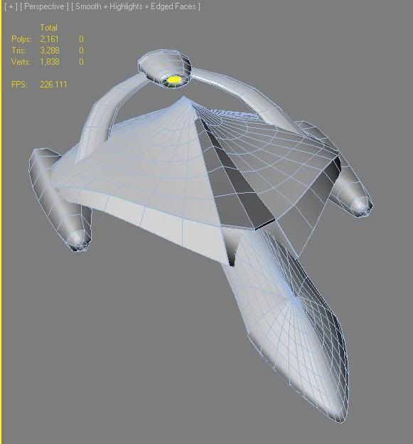
This ship is a bit hard to optimize mesh/poly wise as I used 2 spheres, stretched, squeezed, warped, and tapered all around. Too many curved areas.
- Flattened the wing profile somewhat to make it slimmer.
- lengthened the ship slightly
- Made the forehull section bigger overall so it doesn't look like a goose
- reduced the polys where I could.... not much.
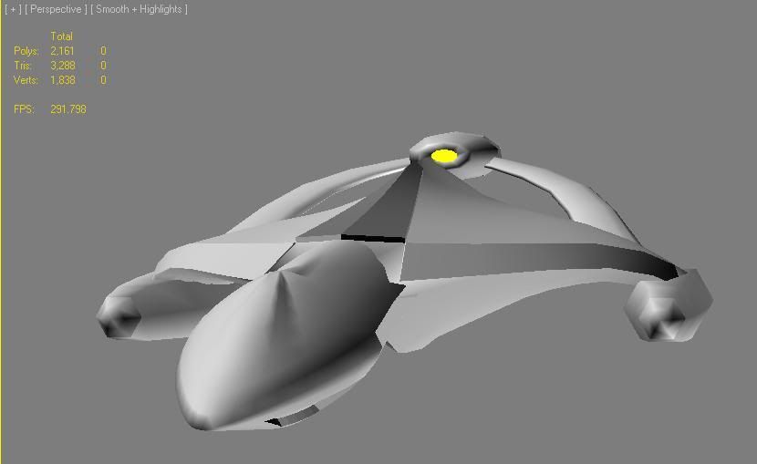


Edged face view to see the complex curves 
_________________
... in space, no one can hear you scream.....

|